# Color Accuracy
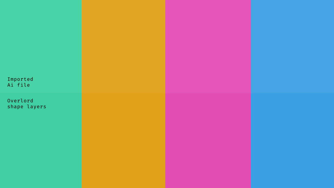
Have you ever transferred layers from Ai and felt like the colors were off, even though Ae tells you the hex colors match?
Color is weird.

You probably know to check to make sure Ai files are RGB and not CMYK, but did you know a color profile can make things look different?
# Convert to shape layers

Before Overlord, it was required to Import an Ai file, then Create Shapes from Vector Layer. Once it converts to shape layers, it's common to notice a color shift. This is because the Illustrator file and the After Effects project are using different color profiles.
Creating shape layers with Overlord has the same potential for introducing this color shift.
# Ai color profile
This is not intended to be an in depth lesson on color profiles. Check out what Adobe has to say (opens new window) about it.
TLDR: Color profiles are instructions about how colors are supposed to look. Shape layers colors are managed by After Effects, but imported footage (that includes Ai files) may have their own profiles that might not be the same as Ae.
# Illustrator color settings
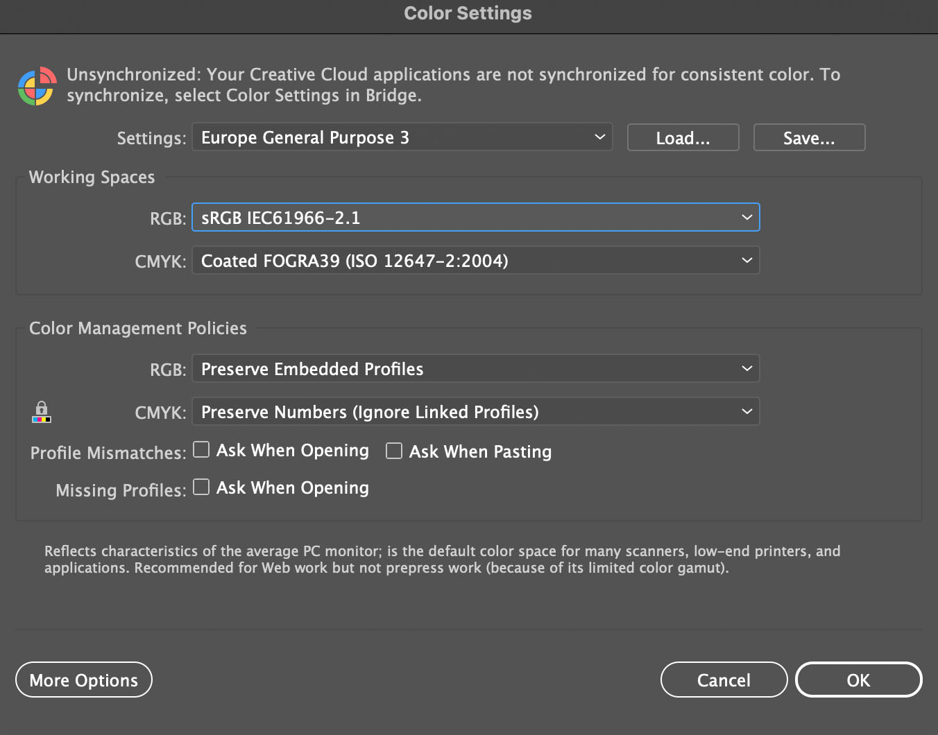
Edit > Color Settings
This is where you will find the color profile that is embedded into saved Ai files.

# After Effects color settings
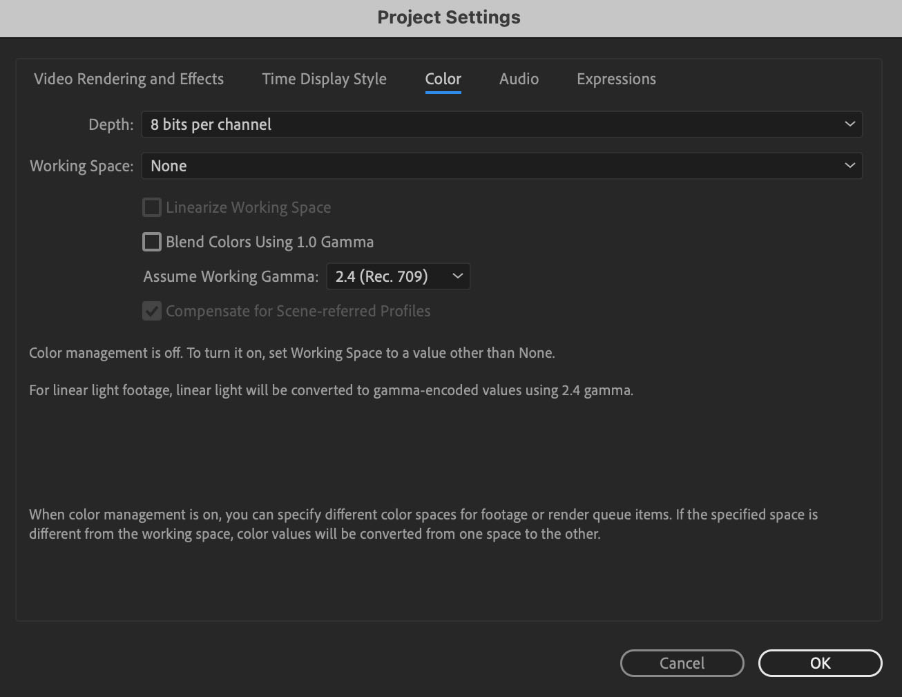
File > Project Settings...
This is where you set the Ae project's color profile. Note: it is possible for these settings to be different between different projects.

# Option #1: Disable Ai color profile
This works great if you need to match Ai art to an Ae project.

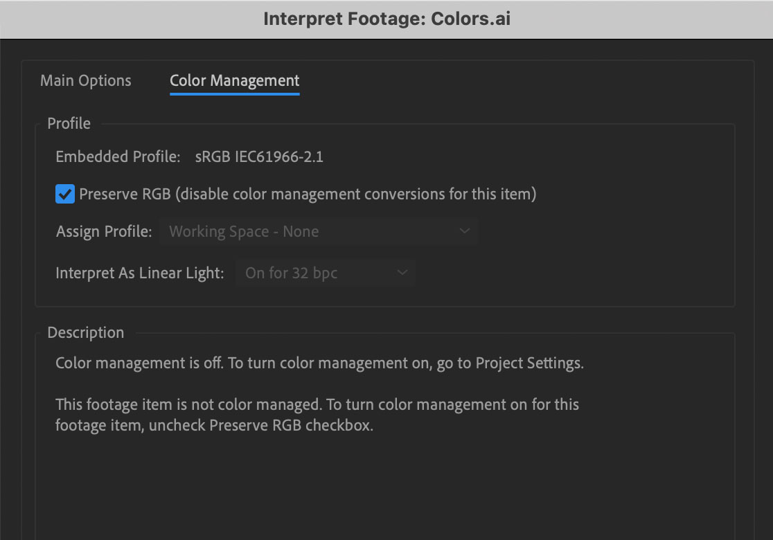
- Select the Ai file
- Click the
Interpret Footagebutton in the bottom right - Select the
Color Managementtab - Add a check to
Preserve RGB

# Option #2: Match your profiles
Our Ai file was created with the sRGB IEC611966-2.1 color profile. So setting Ae to match will fix our colors right away.
This may be done in the other direction too, by updating the Ai color profile to match the Ae profile, but it might change your Ai art in undesirable ways.

# ⚠ Beware linearize working space ⚠
Only use this if you know what you're doing. It is more for visual effects and rarely looks right for graphics.

# Option #3: Mess with options

Working Gamma 2.1 - Our source image uses a 2.1 gamma (sRGB IEC611966-2.1) so if you prefer to turn off color management in Ae, try setting the Working Gamma as close as possible.
Using an Ae working space of None might lead to slightly brighter colors.

Wrong color profile - Setting Ae to the complete wrong profile can have some pretty ugly results.

Blend using 1.0 Gamma - This doesn't make a difference to the flat colors but does affect the edges of the text.